

The Creative Wisdom in The Art of Poster Design
Lessons from a Creative OG Dan Stiles

I was recently taking a Poster design course on domestika:
“Creating Colorful and Conceptual Illustrative Poster Design”
https://www.domestika.org/en/courses/3611-creating-a-colorful-and-conceptual-illustrative-poster-design
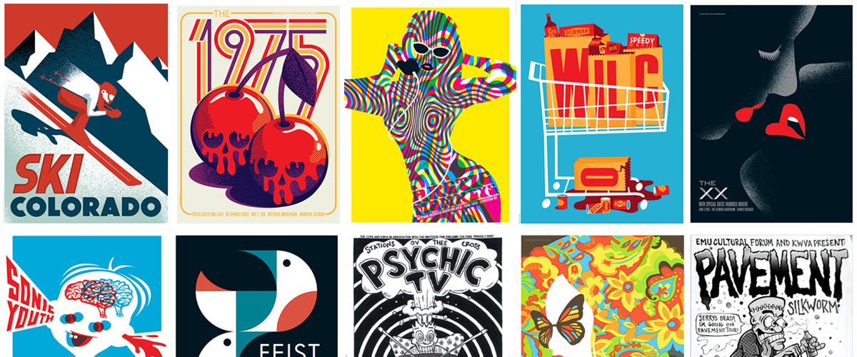
And I gleaned so many insights about his creative process. Dan is a tried and true, experienced, Poster and Graphic Design Artist. He has worked with bands like the Arctic Monkeys. He speaks matter-of-factly with an aura of someone with solid artistic foundation to him, which I believe he has.
As I get older, the more I appreciate the tiny little details some artists make in their process that end up dramatically changing the overall outcomes and trajectory of their great work.
But even to start with - he talks about how you have this trifecta of CRAFT - STYLE - and CONCEPT. I have always loved the concept stage and wish I could spend all my time there, but he emphasized that craft and style are things artists tend to bias towards because we have more control over them and tend to enjoy that part of the process. But he went on to say that with a great concept, you can get away with weaker style and craft ... the concept is much more important. He gave the Godfather logo as an iconic example:

In just a 1 inch 1 inch logo, it tells you much more about the story than a typical concept like a gun maybe with some blood on the lettering which most artists may have designed here, which is why he thinks this logo has stood the test of time. Even though, in his opinion, the font/lettering choice here aren’t that great. I couldn’t agree more about the importance of concept. This has given me the courage and permission I need to spend even more time at the concept stage as its a worthwhile investment.
His general process - or at least the one he shared in the course - starts be spending time heavily researching an artist and then doing 2-3 second sketches of many symbols gleaned from this research. Afterwards, he looks for patterns in the symbols or tries to connect them in unique and interesting ways. For example, cutting an orange in half (orange being the first symbol) and putting a spinning disc on top of it (vinyl disc being the second symbol) for the poster design concept. In maybe 30 seconds each, he quickly drafts these combination ideas into a few broad sketches. Then, he brings a few of them into Adobe Illustrator and narrows them down into a single concept he likes the most and then eventually into a single refined poster design ready to merchandize/sell. It was really cool seeing his process.
Another thing he did which I loved - he mentioned the importance of bringing your font/lettering in much earlier in the process for your design (even as early as when you’re tracing your sketch in Adobe Illustrator). This way, your font and lettering is integrated tighter with your illustrations and the overall composition of your design. I loved this pointer so much … sometimes, the font clearly comes off as an after thought. He may go through 20-60 font choices before deciding on a single one.
Finally, he also mentioned he doesn’t really like using the colour black but will use other colours like dark blue or dark purple (depending on the scene and existing colour palette) to make more interesting designs:

… it’s something subconsciously I may have noticed, but now that he’s pointing it out, it definitely makes me appreciate his work more.